


How to Plan a Mismatched Bridesmaid Look for Small Bridal Parties (Without Colour Duplication!)
If you want a mismatched bridesmaid look without accidental duplicates, keep the plan simple: choose one shared anchor (usually fabric or brand), vary only one or two things, and define “duplicate” by how dresses read in natural light photos, not by the colour name on a website.
For small bridal parties, this matters more than people expect. Cameras compress subtle differences—especially in overcast UK daylight, dim churches, and golden-hour sunset—so two “different” shades online can end up looking identical in real life.
If you do just one thing: agree that “no duplication” means “won’t look the same in daylight photos.”
In this article:
- 1.What This Guide Means by “Polished” (and Who It’s For)
Start With Three Non-Negotiables
1) Pick one anchor that must match
Before you talk colour or style, choose the one thing that stays consistent across everyone. In practice, that’s usually:
- Fabric finish (e.g., all chiffon, all satin, all crepe), or
- One brand (which often standardises fabric + dye)
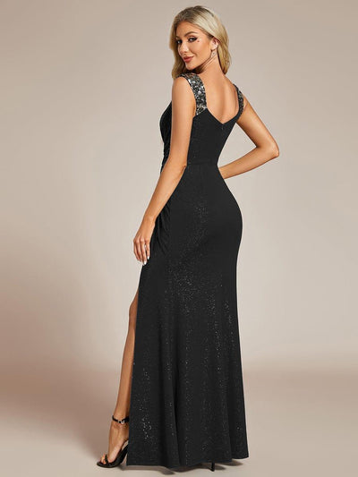
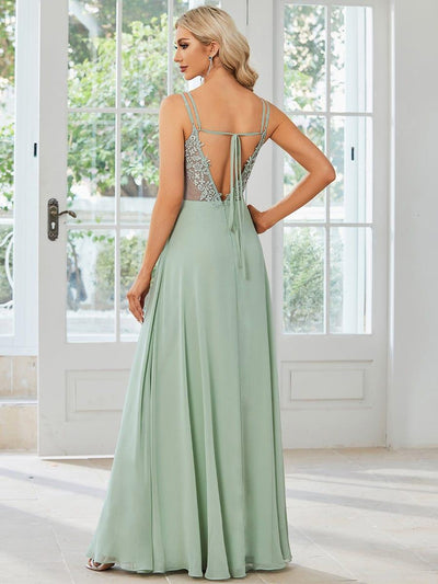
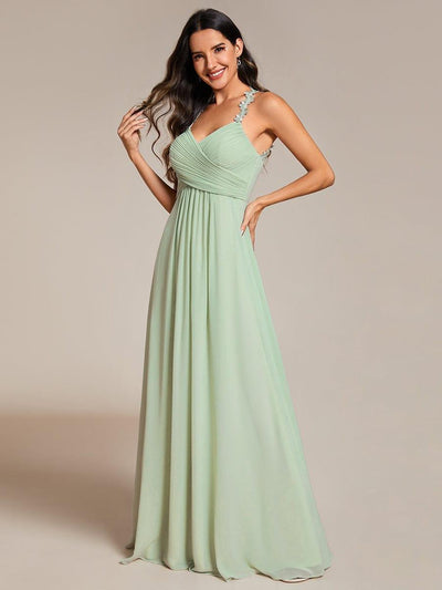
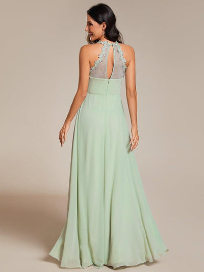
For small groups, fabric finish is a bigger deal than most people realise. A “dusty blue” satin will reflect light and read brighter (sometimes even closer to silver-blue), while a chiffon in the “same” shade looks softer and more muted. In photos, that can make the satin dress feel like it’s from a different palette.
Try not to stack anchors. If you lock in fabric and length and neckline, you’ve basically eliminated the “mismatched” part.

2) Decide what will vary (cap it at 1–2 variables)
Mismatched looks turn messy when too many things change at once. For a small bridal party, one variable is usually enough; two is the upper limit.
Good, manageable combinations:
- Same fabric + same length, different shades
- Same colour family + same fabric, different necklines
- Same colour + same fabric, different silhouettes
What to avoid: if you’re already varying colour, don’t also vary both fabric and length. That’s when one dress starts to look “random” rather than intentional.
3) Define “no duplication” in a way that matches real photos
Be explicit about what “duplicate” means:
- Not: “No one can buy the same named colour.”
- Instead: “No two dresses should read as the same shade in natural light photos.”
A practical way to do this is to agree on a colour family (e.g., dusty blues) and then assign each person a clearly different depth within that family.
Choose a No-Duplication Framework
Option A: One colour family, different shades (ombre/gradient)
Best for: small groups who want a look that reads deliberate instantly.
This is usually the easiest way to avoid duplication. It works best when shades are ordered (dark → light), not scattered randomly—otherwise the gradient effect disappears.
Example “Dusty Blue” ladder (5 steps):
- Step 1: Deep navy-blue (reads almost ink in photos)
- Step 2: Midnight blue
- Step 3: Dusty denim / slate blue
- Step 4: Soft dusty blue
- Step 5: Pale powder blue
If you can’t confidently label each dress as a distinct step, two shades are too close.

Option B: Two-colour split with unique pairings (no repeats)
Best for: people who like structure without micro-shades.
Instead of five similar blues, choose two complementary families and make sure no exact shade appears twice (and keep undertones deliberate).
Example splits that photograph well:
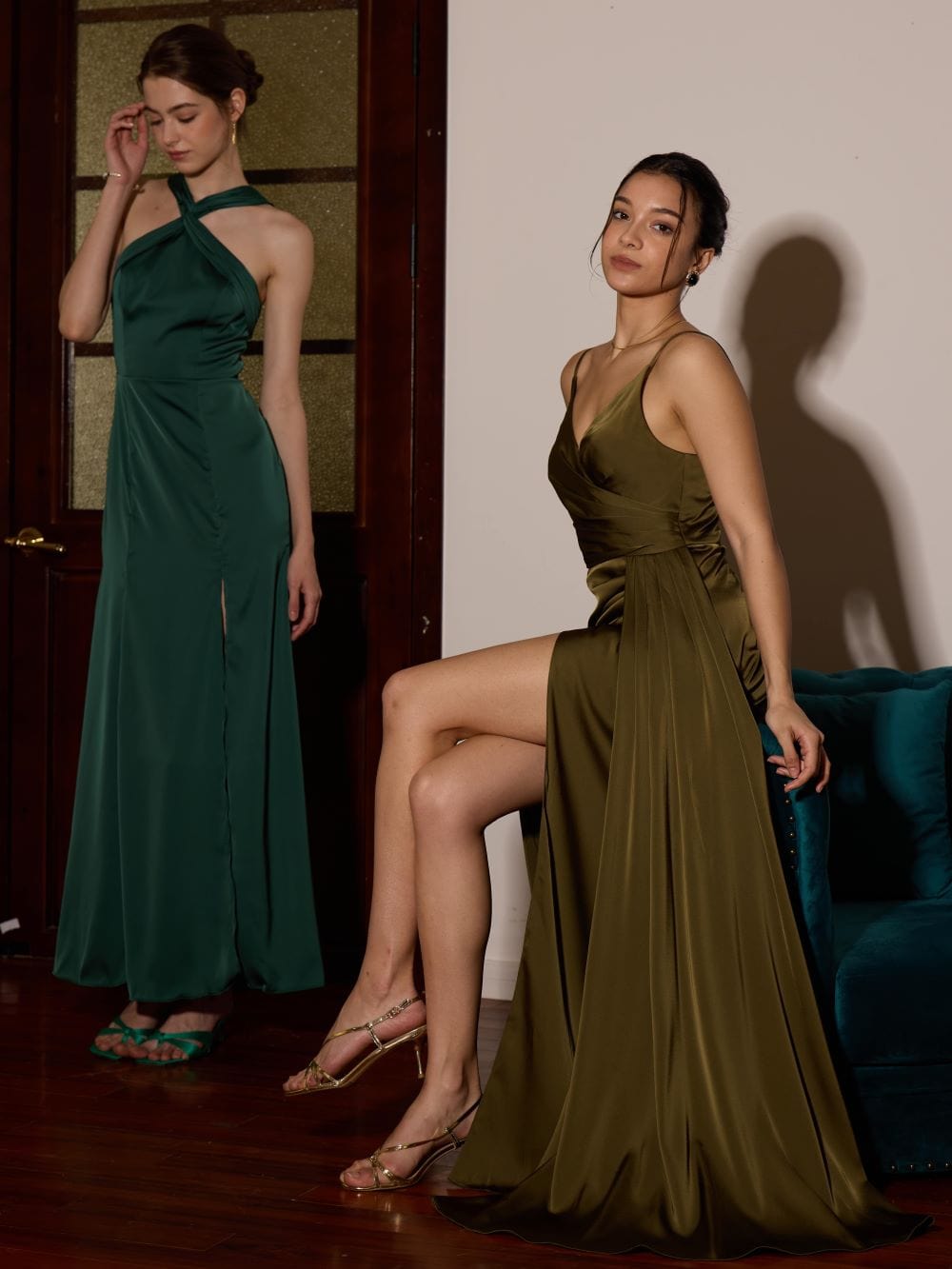
- Sage green + champagne neutrals
- Dusty blue + taupe
- Terracotta + muted rose
This reduces duplication risk because you’re not asking everyone to shop in a narrow band of nearly identical shades.
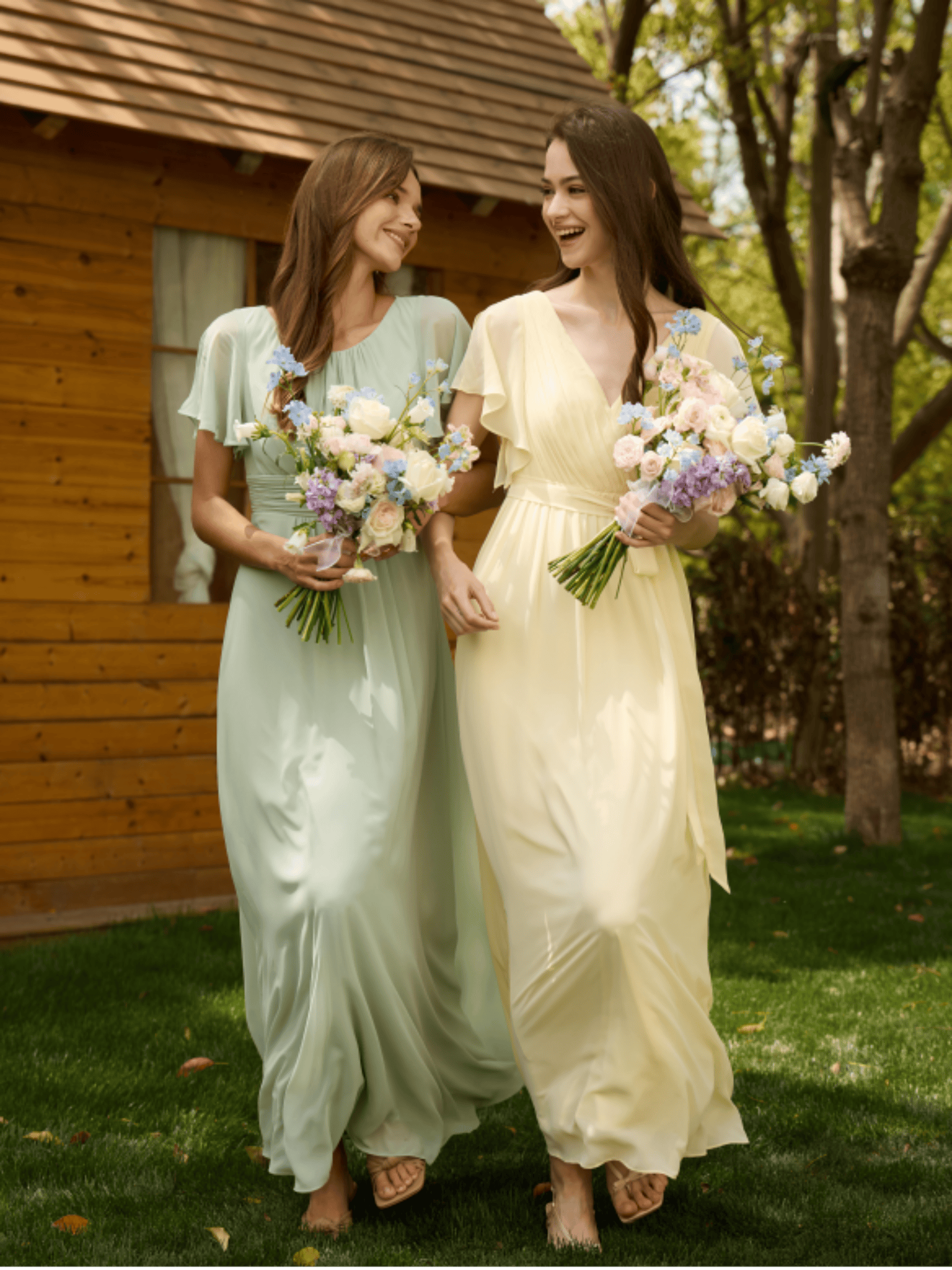
Option C: Mixed neutrals + one accent colour (controlled variety)
Best for: brides who want mismatch without “rainbow energy”.
Neutrals can be forgiving in small groups—if you choose neutrals with clearly different undertones.
Concrete neutral set that avoids near-matches:
- Cool taupe (grey-leaning)
- Warm champagne (gold-leaning)
- Soft dove grey (blue-leaning)
- Muted blush (pink-leaning)
Add one accent (one bridesmaid in a deeper tone, or an accent via wraps/accessories) so it doesn’t look flat.
Option D: Texture/pattern as the differentiator (keep colour tight)
Best for: one-colour looks where you still want each person to feel different.
This only works if the base colour is genuinely consistent. Once you vary both colour and pattern, it can look unplanned fast.
Think: same shade family, but mix matte crepe, soft chiffon, subtle jacquard, minimal sheen satin—all within a controlled palette.

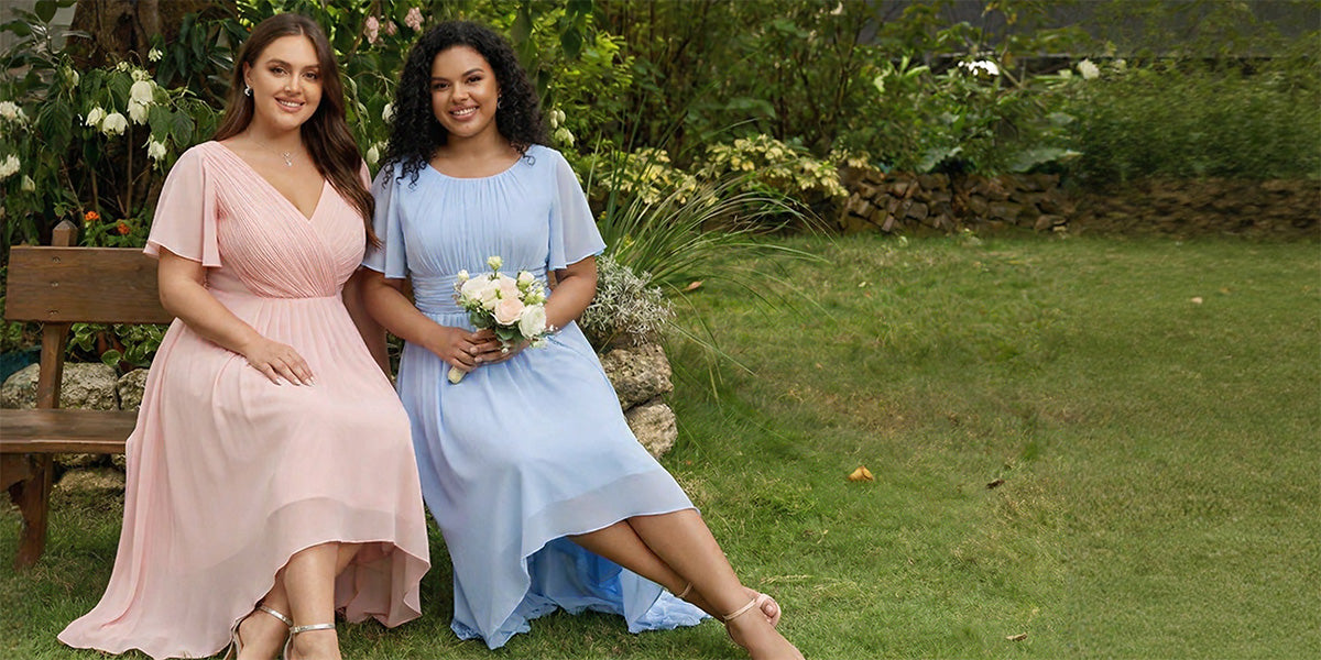
Match the Plan to Your Party Size (3–7 Bridesmaids)
3 bridesmaids: one dark, one mid, one light
With three people, keep it clean: one colour family, three clearly different depths.
A common mistake is letting everyone “choose freely” and hoping it works out. With only three dresses, one off-tone dominates immediately.
4 bridesmaids: two tone groups, balanced placement
Four works well as pairs—two deeper, two softer (or two warm-leaning, two cool-leaning). You’re aiming for symmetry in photos, not four unrelated decisions.
5 bridesmaids: the 5-step shade ladder
Five is ideal for a ladder—if each step is meaningfully separated. Two mid-tones that look different on a phone screen can collapse into “the same dress” outdoors.
6–7 bridesmaids: grouped pairs/trios (without repeats)
At 6–7, full gradients can become fiddly. A practical approach is grouping by tone into pairs/trios (e.g., two deep, two mid, two light), ensuring no exact shade repeats.
Key detail: avoid one “in-between” dress that sits awkwardly between groups—grouping should read intentional in line-ups.
Prevent Duplication in the Real World (Especially with Online Shopping)
One brand vs multi-brand: the trade-off
- One brand + one fabric = lowest risk, easiest approvals
- Multi-brand = more choice, but you need tighter checks (especially for undertone and finish)
If you’re mixing brands, keeping the fabric type/finish consistent is the most reliable stabiliser.

Use swatches when the difference is subtle
Swatches are worth it when shades are close—or when your venue lighting will amplify confusion.
Swatches matter most for UK-typical scenarios like:
- Church ceremonies (dim interiors; dark colours read darker and similar shades merge)
- Overcast outdoor photos (common UK light; tones flatten and “dusty” colours converge)
- Golden hour / sunset (warm light pushes colours warmer; blush/champagne/terracotta can all shift)
Seeing fabrics side-by-side usually reveals what screens hide: undertone differences (pink vs peach vs beige), and how sheen changes the perceived shade.
Add a simple approval step (without killing the fun)
A light-touch system prevents last-minute surprises:
- One shared thread
- Each bridesmaid posts a link + screenshot (and ideally a fabric note: “chiffon” / “satin”)
- One clear “approved” reply before checkout
- A deadline for approvals (so you don’t drift)
Treat “different names, same colour” as high-risk
Many brands use different labels for near-identical shades. These are frequently “the same in photos” unless proven otherwise:
- navy / midnight / ink
- champagne / sand / light gold
- dusty rose / mauve / antique pink
- sage / eucalyptus / soft olive
- slate / steel / storm blue
Also note: dye lots can vary even within the same brand. If two dresses are ordered weeks apart, the “same” shade can arrive slightly different—or two “different” shades can arrive nearly identical.

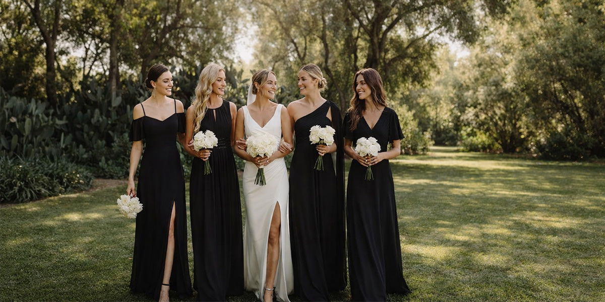
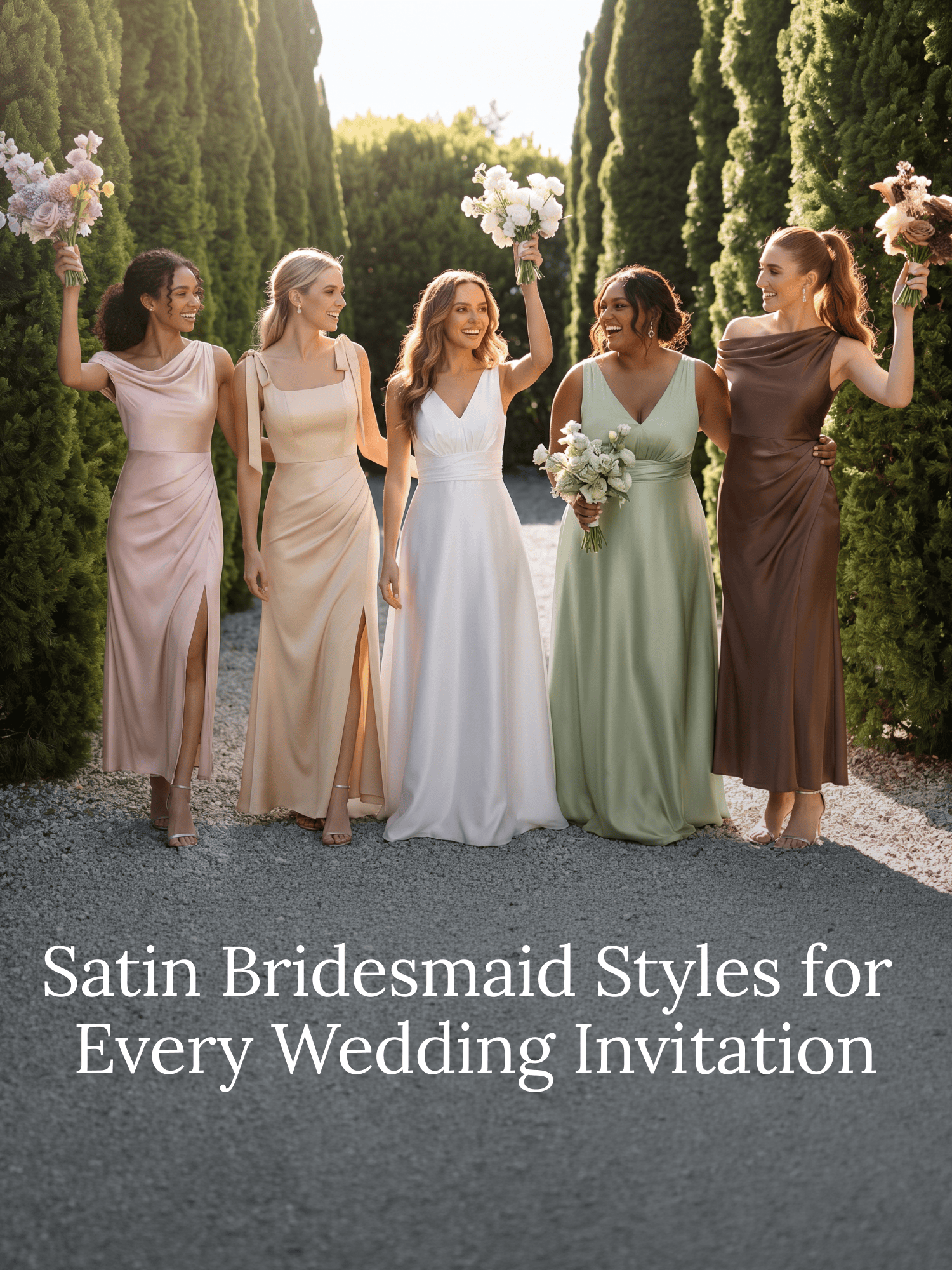
Keep It Cohesive When Colours Differ
Fabric finish consistency
If colours vary, matching finish is one of the easiest ways to keep the set looking intentional. Satin will read more reflective and can appear lighter or more dramatic than matte fabrics beside it. That’s often where the “odd one out” happens.
Length: match or split evenly
For small parties, either keep everyone in the same length, or split lengths evenly. One lone midi among floor-length gowns rarely looks intentional in photos.
One styling anchor is enough
Choose one unifier—more than that becomes restrictive.
Low-drama anchors:
- same shoe colour (not necessarily identical shoes)
- same jewellery metal (all gold or all silver)
- same wrap/shawl tone
Florals can “join” the palette—if they echo rather than compete
If dresses span multiple shades, bouquets can pull the look together by repeating small hints of each tone. Keep bouquet colours slightly muted so they don’t fight the dresses (especially helpful in bright outdoor shots).
Budget-Sensitive Planning (Without Losing Control)
Set a budget ceiling and a minimum-quality rule
Agree a max spend early, then add a simple quality floor so you don’t pay later for returns and re-orders.
Examples:
- “Must be fully lined”
- “Avoid ultra-shiny satin”
- “Chiffon/crepe only” (if you’re controlling finish)
Watch the real cost traps
Most surprises come from:
- alterations
- return shipping
- rush delivery
If you’re mixing brands, build in time for exchanges. More “mismatch freedom” requires a clearer timeline.

A simple timeline that works
- Choose framework + palette first
- Approve selections second
- Order early enough for alterations
- Leave space for one round of exchanges
A Quick Planning Check
- Can you describe the anchor in one sentence?
- Are you varying more than two variables?
- Does everyone share the same definition of “duplicate”?
- Is there an approval step before anyone buys?
If any answer is “no”, that’s where duplication usually slips in.
Wrap-Up: The Simplest Way to Avoid Colour Duplication
Small bridal parties don’t need more freedom—they need a clearer, lighter framework. Choose one anchor, keep variation to one or two variables, and define “no duplication” by how dresses read in natural light photos. Add a basic approval step, and you’ll catch near-matches early—before they become expensive, stressful problems.