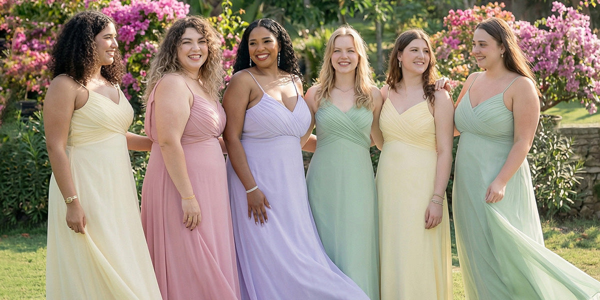
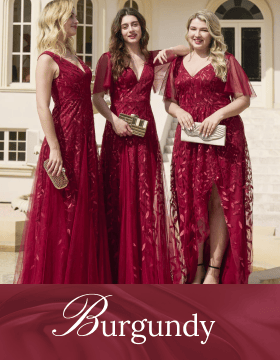


2021 SS Fashion Color Trend
After doing nothing more than spend 2020 in lousy loungewear, the much-needed escape has been offered by influential fashion designers who highlighted striking prints, voluminous silhouettes, minimalist neutrals, and vivid colors for the 2021 SS fashion trends.
The eye-catching colors injected throughout the lines by Pantone Color Institute and Shutterstock have been nothing short of mesmerizing. The predictions released in the last two months feature 10 extraordinary colors together with 5 core classics we anticipate on New York runways. Natural elements have been the inspiration behind the soothing, bright colors.
Experts from the institute have highlighted the desire for an ingenious and inventive range of colors on the Spring/Summer 2021 fashion color trend. After all, history has taught us that creativity and fantasy can be pushed beyond normal bounds during periods of depression and significant restrictions.
These versatile colors go beyond seasons and permit freedom of choice. They are flexible, easily adapting to our current disintegrated lifestyle.
Hope and optimism are the inspiration behind the new SS 2021 palette. The bright yellow hues and ultimate grays that Pantone revealed in December illustrate positivity, stability, and unity. These colors will run the show and make a serious impact in 2021.
What is the Pantone Color System?

Pantone Color System is a universally structured color matching system that helps manufacturers and brands make important color-based decisions during every stage of the workflow process. Millions of producers and designers rely on the Pantone Color System for color specification and control from the point of inspiration up to realization in the manufacturing process.
This system communicates and defines colors that can be mixed during the processing and manufacturing of materials for product design, fashion, and graphics.
The company that invented this system is called Pantone Inc. and the name Pantone Color System was adopted from it. The system allocates specific numbers to each color, which is then used to describe it, e.g pink is defined as PMS 205. Marketers, artists, manufacturers, designers, and printers rely heavily on this system which is now universally accepted.
Pantone has become popular and successful for two main reasons; by successfully naming all the different shades and tones of colors, it has defined itself as the universal language of color that is used globally. The Pantone Color System also has high degrees of accuracy when it comes to the excellent specification of design, identification of colors, and quality control.
How does the Pantone Color System work?
The “global authority on color”, as Pantone describes itself, has unveiled Ultimate gray and Illuminating as Pantone Colors of the Year. This comes as a surprise as many wonders just how one company has the power to choose one color over millions of others.
This is a practice that started 21 years ago when the process was just an afterthought between a few individuals. Today, the Pantone Color Institute has grown into a 20-person team that begins their worldwide color research during the onset of spring.
This team observes the patterns and colors that seem to recur in daily life situations and then they come up with color trends. This process takes almost 9 months.
Pantone Color Institute has clarified in the past that the Color of the Year is more of a reflection of what is happening in our global culture. The color or colors chosen serve as a way of expressing the mood and attitude of everything that is happening in the world.
For example, ultimate gray and illuminating conveys hope and strength amid a worldwide pandemic.
“The two colors have been appearing in many different places together,” – Pantone’s General Manager and Vice Person Ron Potensky explains, “you can’t see one without the other, they are almost like two sides of the same coin.”
Spring Summer 2021 Color Pantone Trends
For many years, Pantone has used colors to reflect what the global community is discussing at large. It is therefore not surprising that yellow is taking over the world after the pandemic. The two colors were chosen for Spring Summer 2021 are a prediction of brighter, cherry days.
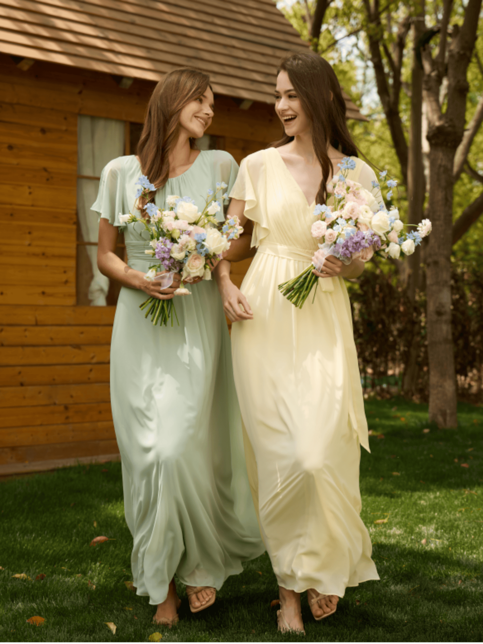
1. Color of the Year – Illuminating Yellow, Ultimate Grey
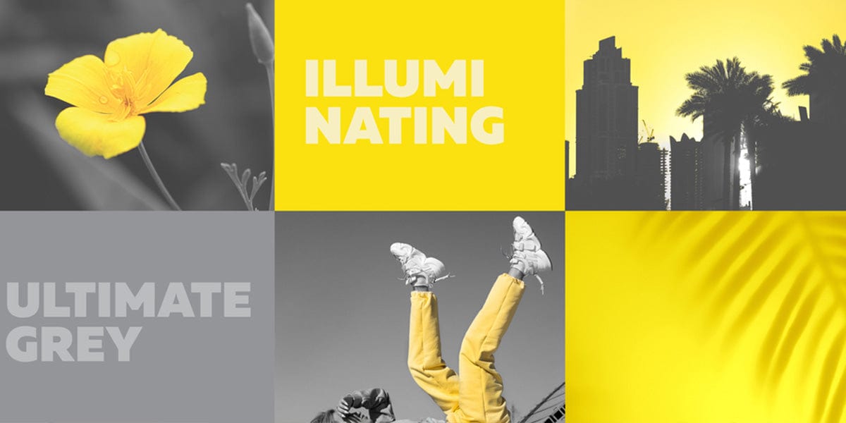
2021 is unique because it is the second time in 21 years that Pantone has chosen two colors at once. These two colors are an interesting blend. Pantone chose Ultimate Grey to represent the resilience and power it has taken to walk out of 2020 after wrestling with the global pandemic. On the other hand, the charming shade of Illuminating yellow reflects hope for better days.
The two shades combined bring warmth and some sense of dependability.
In a news statement, Pantone describes the illuminating yellow as vivacious, cheerful, and sparkly. It is a warm hue that vibrates with solar energy. Ultimate grey represents strong elements that are emblematic of a powerful foundation.
Even though these two colors are independent, they come together to express an uplifting and enduring message. The human spirit needs encouragement and motivation right now, and that is the spirit that these color combinations represent.
Every season, marketers in technology, fashion, textile, furniture, interior design and home décor depend on Pantone's color forecasting abilities to come up with their seasonal designs. You can now expect your inbox to be flooded with advertisements of yellow and grey items from fashion brands, retailers, and designers.
Ultimate grey and illuminating yellow are a powerful combination that represents the positivity we need to reinvent, reimagine, reset and renew ourselves.
Ultimate Grey has the perfect neutralizing effect, while yellow simply makes you happy.
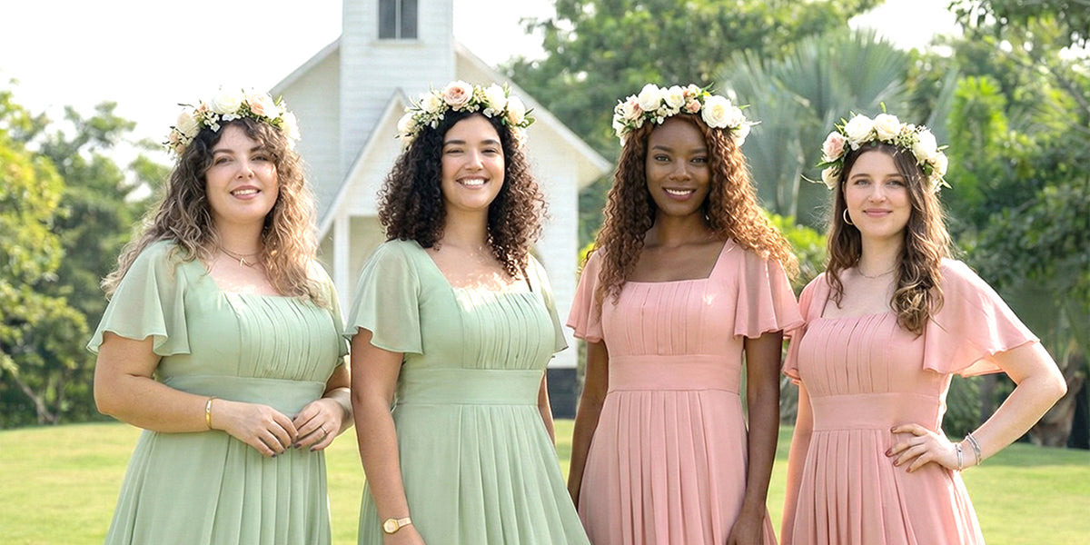
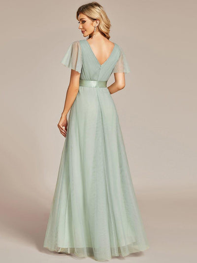
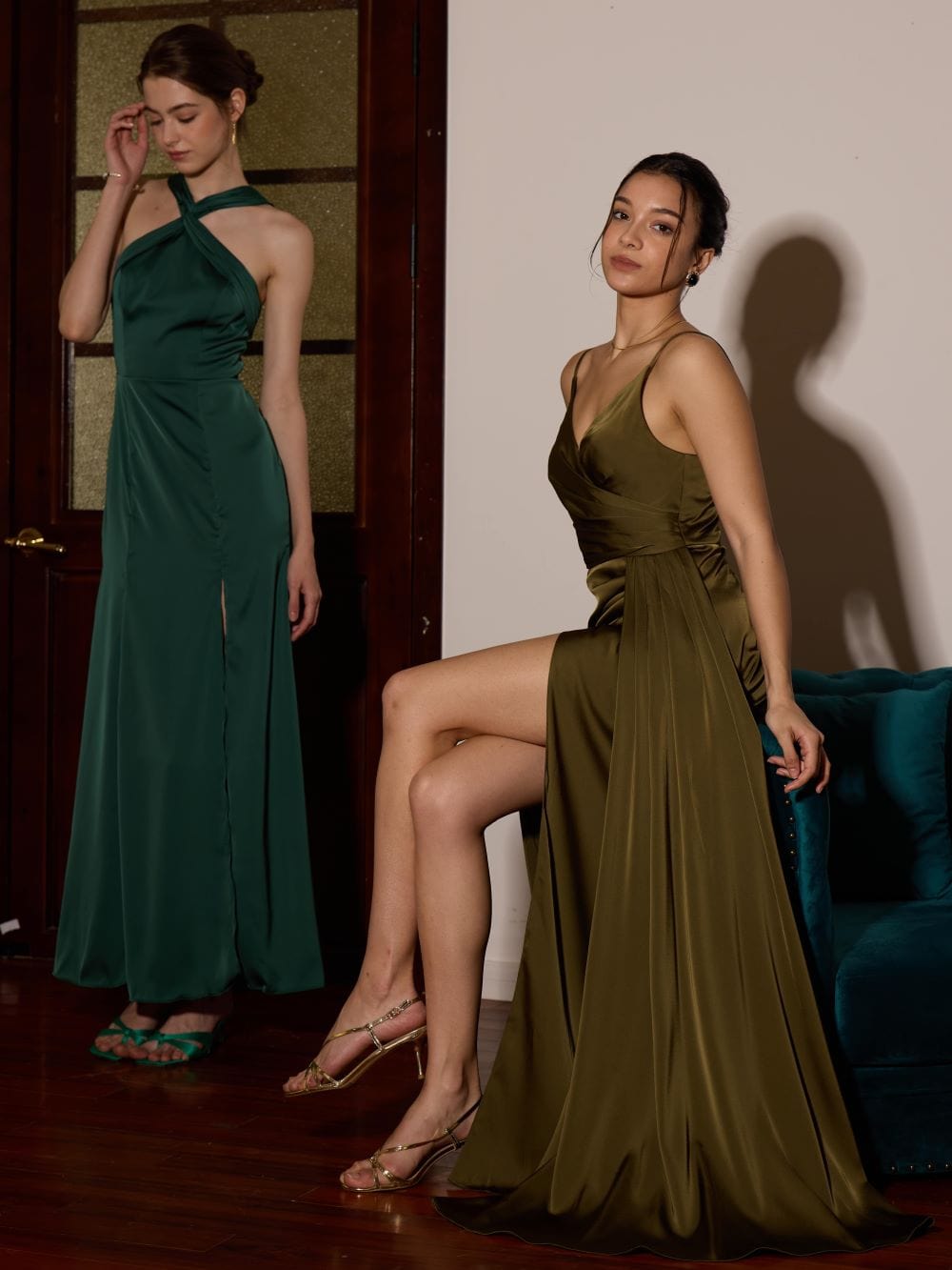
2. Continuation of the breath of natural vitality – Green Ash
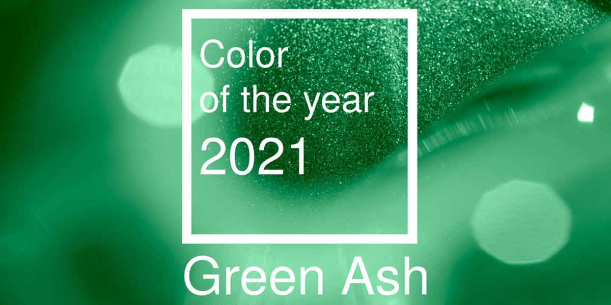
During the pandemic, outdoor activities such as hiking and gardening became increasingly popular. Pantone chose Green Ash because it represents nature. The color has restorative and regenerative vibes which everyone needs in the world right now. Green ash also embodies rebirth and fertility.
Green calls for expansion, growth, goals, ambition, and focus. It is to many people a "Type-A energy" hue. Green ash is the color that motivates you to get things done.
Green Ash is a groundbreaking color for spring 2021. It kept the runways fresh as ever. Neon colors saturated the system this season, so this muted shade of green was more than welcome. Whether on the sleeves of puffed jackets and dresses or when included in monochrome looks, green ash made an undeniable impact.
After making an appearance on runways for brands such as Miu Miu, Armani, Boss, Ferragamo, and many others, expect green ash to be everywhere during spring.
3.Full of tranquil and clear breath – Cerulean Light Gray Blue
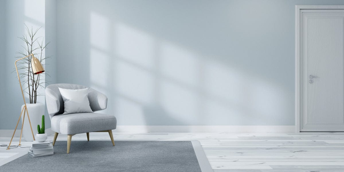
The Cerulean light gray-blue was also an inspiration from the outdoors. The gray-blue hues are reminiscent of a clear sky during summer. The calming nature of the cerulean is expected to be a favorite among people looking for a fresh twist of color.
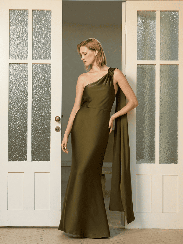
4. Atypical spring calm – Rust rusty brown
It was surprising to see Rusty brown as one of Pantone’s 2021 SS Fashion Color Trends. It brings uncharacteristically chic vibes into the picture. The shade of brown feels not just earthly, but also elegant because of the amber undertones.
Rusty brown spreads independent, creative and confident energy. Brown is a powerful color that represents liveliness. Whenever you are feeling low, rusty brown will boost your vitality and keep you motivated. After spending lots of time indoors, the energy rusty brown speaks to all of us.
Pantone predicted rusty brown accurately because it is already one of the most popular color choices seen on fall runways of the NYFW. The gingerly tints of rust rusty brown have a sense of seasonless appeal. Could this be why Meghan Markle and Victoria Beckham love it so much?
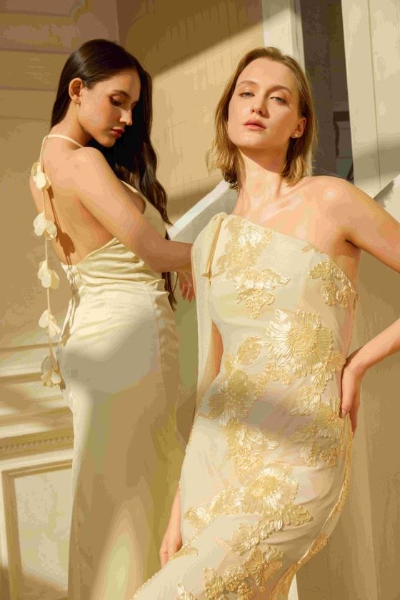
5. Adjust the neutral color of various colors – Buttercream
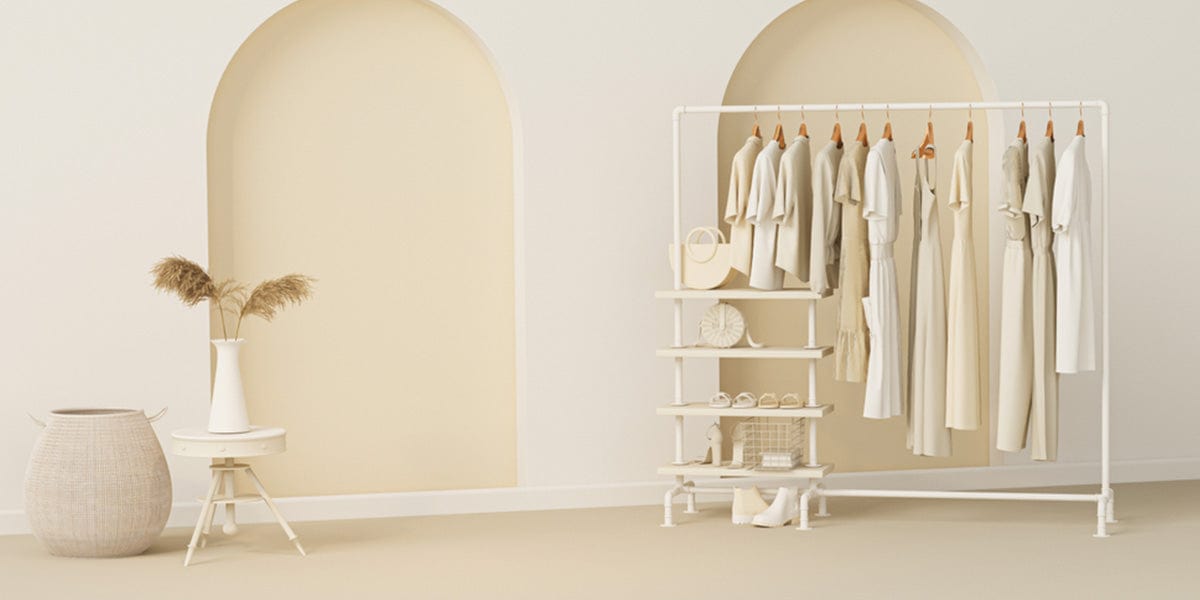
The buttercream was a breath of fresh air for everyone after the color splashes this season. Even as an all-time neutral, buttercream received a colorful update as well. Buttercream gets its inspiration from the baking obsession during the pandemic.
The yellow tints of buttercream added elegance to Pantone’s 2021 Fashion color trends. Other color trends navigated towards bright hues of eye-catching colors such as vibrant pink, cherry red, Fuchsia Fedora, Mykonos Blue, and Fire Whirl.These color trends are designed to bring a sense of positivity, hope, and refreshment that many people are longing for after a tumultuous 2021. Colors are powerful, especially when they are intended to touch on people's emotions. Every color evokes moods, energies, and meanings deeper than what the eye sees.
Our best hope is that Pantone’s optimistic color predictions are accurate and that 2021 is going to be a stable year full of positivity and growth.